
The objective of data visualization is to communicate key results from the data analysis workflow. And while a chart must look aesthetically appealing, its primary objective is not to ‘look pretty’.
Use of color in a visualisation should be to help disseminate key findings instead of being part of some sort of artistic endeavor
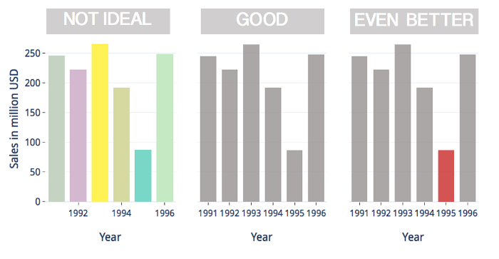
Rule 1 : Use color when you should, not when you can
Use of color should be carefully strategized to communicate key findings and this decision, therefore, cannot be left for automated algorithms to make. Most data should be in neutral colors like grey with bright colors reserved for directing attention to significant or atypical data points.
Rule 2: Utilize color to group related data points
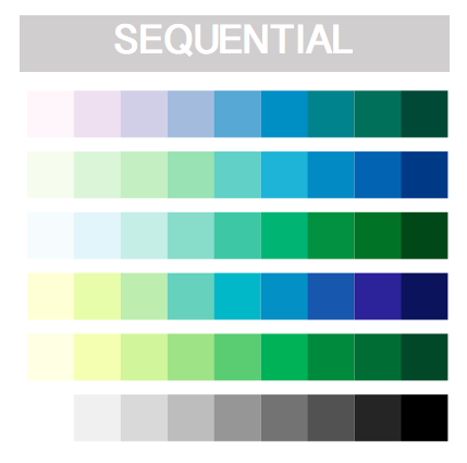
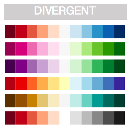
Color can be used to group data points of similar value and to render the extent of this similarity using the following two color palettes :
A sequential color palettes is composed of varying intensities of a single hue of color at uniform saturation. Variability in luminance of adjacent colors corresponds to the variation in data values that they are used to render.
A divergent color palettes is made of two sequential color palettes (each of a different hue) stacked next to each other with an inflection point in the middle. These become helpful when visualizing data with variations in two different directions.
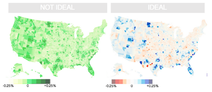
The chart below on the left uses a sequential color palette made of a single hue (green) for values ranging from -0.25 to +0.25 while chart on the right uses a divergent color scheme with different hues for positive (blue) and negative (red) values.
In the map on the right, positive and negative values can be identified immediately based on color alone. We can immediately conclude that the population of mid-western and southern towns had declined and that in the east and west coast has increased. This key insight into the data is not immediately obvious in the chart on the left where not color itself, but the intensity of color green must be used to read the map.
Rule 3: Use categorical colors for unrelated data
Categorical color palettes are derived from colors of different hues but uniform saturation and intensity and can be used to visualize unrelated data points of completely dissimilar origin or unrelated values. Check out this visualisation of different ethnicities in New York City. There is no correlation between the data for different ethnicities and a categorical palette is therefore used here.
Sequential and divergent color palettes should be used to render changes in magnitude by encoding qualitative values while categorical color palettes should be used to render unrelated data categories by encoding quantitative values.
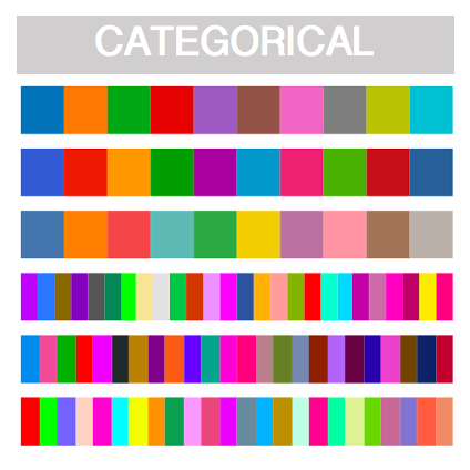
Rule 4: Categorical colors have few easily discernible bins
While the use of different colors can help distinguish between different data points, a chart should at most comprise of 6–8 distinct color categories for each of those to be readily distinguishable.
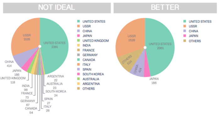
Use of a separate colour for each of the 15 countries makes the chart on the left difficult to read, especially for countries with fewer satellites. The one on the right is much more readable at the cost of losing information on countries with fewer satellites, all of which is grouped in the “others” bin.
Note that we have used a categorical color scheme here as the data for each country is completely uncorrelated. The number of India satellites, for instance, is completely independent of those of say France.
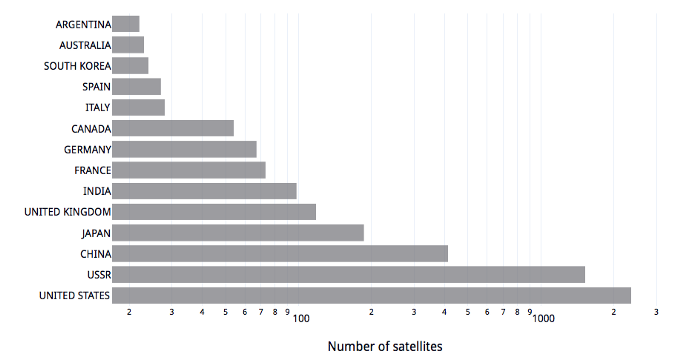
Rule 5: Change in chart type can often reduce the need for colors
A pie chart probably is not the best option in the previous example. The resulting loss of categories may not always be acceptable. Plotting a bar chart instead, we can use a single color and retain all 15 data categories.
If there is a need for more than 6–8 different colours (hues) in a visualization, either merge some of the categories or explore other charts types
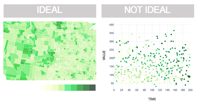
Rule 6: When not to use sequential color scheme
For the subtle difference in color of a sequential palette to be readily apparent, these colors must be places right next to each other like in the chart on the left below. When place away from each other like in a scatter plot, the subtle differences become difficult to grasp.
Sequential color schemes are difficult to interpret when the data points are not located immediately next to each other as in the scatter plot on the right. These colors may only be used to visualize relative values as in the chart on the left. [made by author]
Best use of a sequential color scheme is to render relative difference in values. It is not suitable for plotting absolute values which are best rendered with a categorical color scheme.
Rule 7: Choose appropriate background
Check out this animation by Akiyoshi Kitaoka that demonstrates how our perception of color of the moving square changes with changes in its background. The human perception of colors is not absolute. It is made relative to the surroundings.
Perceived colour of an object is dependent not only on the colour of the object itself but also of its background. This leads us to conclude the following with respect to use of background colors in charts : Different objects grouped by same colour should also have same background. This in general means that variations in the background colour must be minimised.
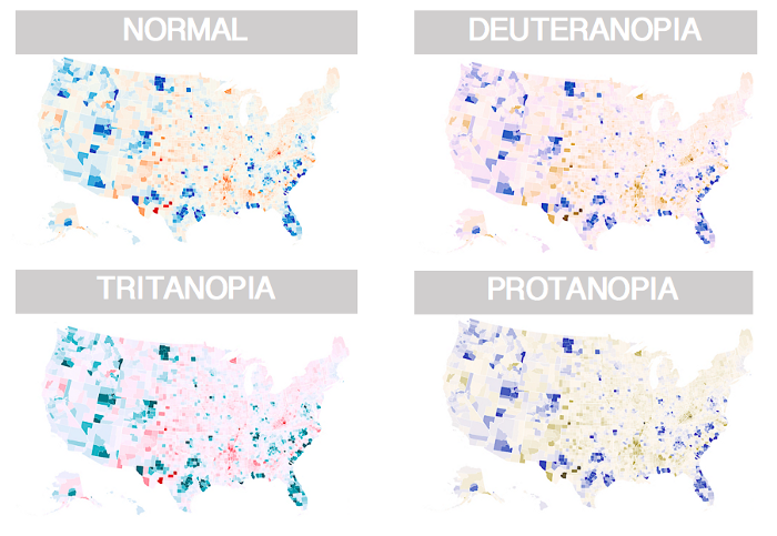
Rule 8: Not everyone can see all colors
Roughly 10% of the world population is colour blind and to make coloured infographics accessible to everyone, avoid use of combinations of red and green. Shown below are how people with three different kinds of color blindness view the same map.
Conclusion
The impetus of visualisation is to tell the story behind data. Only a thoughtful use of colour can help strengthen key arguments in this story. Tools for selecting colour combinations.
Summarised below are some resources that I have found helpful in my work on the use of colours in data analysis and visualization.
- Colour brewer Link
- d3-interpolate Link
- Colourco Link
- Color Palette Helper Link
- I want hue Link
- colorspace Link
- tmaptools palette explorer Link
- Leaflet colors Link
Crédito: Este artigo é uma tradução do artigo 8 Rules for optimal use of color in data visualization Why color is key for effective data visualization by Assem Kashyap